
Cafedev chia sẻ cho ace về hiểu layout – bố cục một trang web đơn giản với CSS thông qua ví dụ và thực hành chi tiết tại bài này.
Nội dung chính
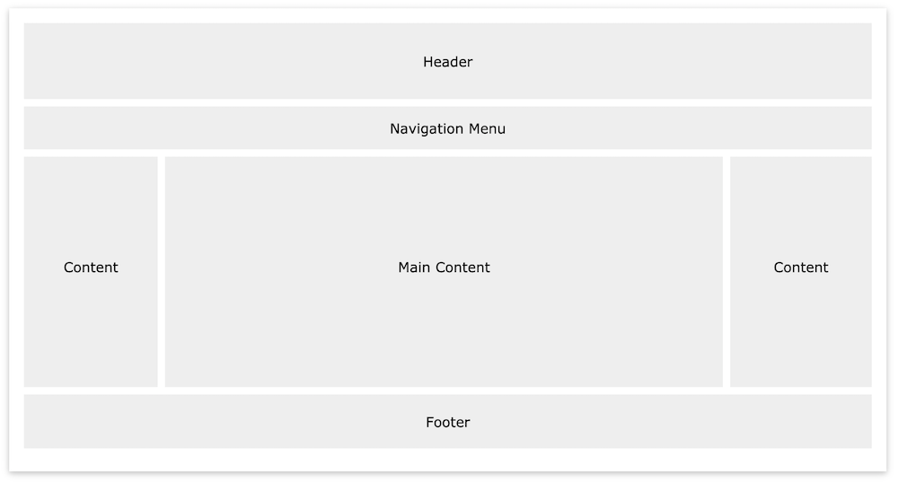
1. Website Layout – Bố cục trang web
Một trang web thường được chia thành đầu trang, menu, nội dung và chân trang(headers, menus, content and a footer):
Có rất nhiều thiết kế bố trí khác nhau để lựa chọn. Tuy nhiên, cấu trúc trên là một trong những cấu trúc phổ biến nhất và chúng ta sẽ xem xét kỹ hơn trong hướng dẫn này.
2. Header
Tiêu đề thường nằm ở đầu trang web (hoặc ngay bên dưới menu điều hướng trên cùng). Nó thường chứa một biểu trưng hoặc tên trang web:
<!DOCTYPE html>
<html lang="en">
<head>
<title>CSS Website Layout</title>
<meta charset="utf-8">
<meta name="viewport" content="width=device-width, initial-scale=1">
<style>
body {
  margin: 0;
}

/* Style the header */
.header {
  background-color: #f1f1f1;
  padding: 20px;
  text-align: center;
}
</style>
</head>
<body>

<div class="header">
  <h1>Header cafedev </h1>
</div>

</body>
</html>
3. Navigation Bar
Thanh điều hướng chứa danh sách các liên kết để giúp khách truy cập điều hướng qua trang web của bạn:
<!DOCTYPE html>
<html lang="en">
<head>
<title>CSS Website Layout</title>
<meta charset="utf-8">
<meta name="viewport" content="width=device-width, initial-scale=1">
<style>
* {
  box-sizing: border-box;
}

body {
  margin: 0;
}

/* Style the header */
.header {
  background-color: #f1f1f1;
  padding: 20px;
  text-align: center;
}

/* Style the top navigation bar */
.topnav {
  overflow: hidden;
  background-color: #333;
}

/* Style the topnav links */
.topnav a {
  float: left;
  display: block;
  color: #f2f2f2;
  text-align: center;
  padding: 14px 16px;
  text-decoration: none;
}

/* Change color on hover */
.topnav a:hover {
  background-color: #ddd;
  color: black;
}
</style>
</head>
<body>

<div class="header">
  <h1>Header</h1>
</div>

<div class="topnav">
  <a href="#">Link</a>
  <a href="#">Link</a>
  <a href="#">Link</a>
</div>

</body>
</html>
4. Content
Bố cục trong phần này, thường phụ thuộc vào mục tiêu người dùng. Bố cục phổ biến nhất là một (hoặc kết hợp chúng) như sau:
- 1 cột (thường được sử dụng cho trình duyệt trên thiết bị di động)
- 2 cột (thường được sử dụng cho máy tính bảng và máy tính xách tay)
- Bố cục 3 cột (chỉ được sử dụng cho máy tính để bàn)
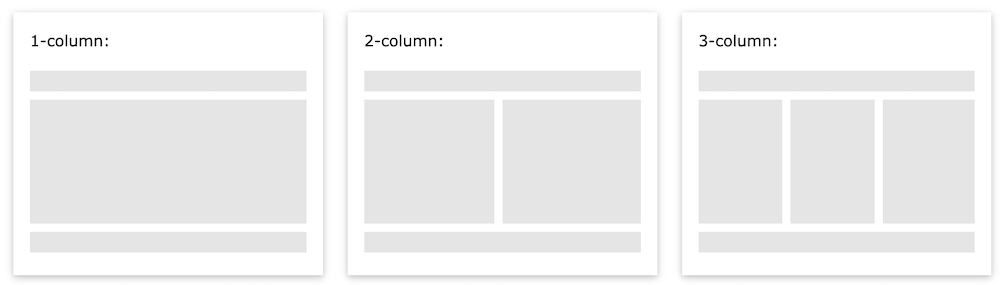
Chúng tôi sẽ tạo bố cục 3 cột và thay đổi nó thành bố cục 1 cột trên màn hình nhỏ hơn:
<!DOCTYPE html>
<html lang="en">
<head>
<title>CSS Website Layout</title>
<meta charset="utf-8">
<meta name="viewport" content="width=device-width, initial-scale=1">
<style>
* {
  box-sizing: border-box;
}

body {
  margin: 0;
}

/* Style the header */
.header {
  background-color: #f1f1f1;
  padding: 20px;
  text-align: center;
}

/* Style the top navigation bar */
.topnav {
  overflow: hidden;
  background-color: #333;
}

/* Style the topnav links */
.topnav a {
  float: left;
  display: block;
  color: #f2f2f2;
  text-align: center;
  padding: 14px 16px;
  text-decoration: none;
}

/* Change color on hover */
.topnav a:hover {
  background-color: #ddd;
  color: black;
}

/* Create three equal columns that floats next to each other */
.column {
  float: left;
  width: 33.33%;
  padding: 15px;
}

/* Clear floats after the columns */
.row:after {
  content: "";
  display: table;
  clear: both;
}

/* Responsive layout - makes the three columns stack on top of each other instead of next to each other */
@media screen and (max-width:600px) {
  .column {
    width: 100%;
  }
}
</style>
</head>
<body>

<div class="header">
  <h1>Header</h1>
  <p>Resize the browser window to see the responsive effect.</p>
</div>

<div class="topnav">
  <a href="#">Link</a>
  <a href="#">Link</a>
  <a href="#">Link</a>
</div>

<div class="row">
  <div class="column">
    <h2>Column</h2>
    <p>Lorem ipsum dolor sit amet, consectetur adipiscing elit. Maecenas sit amet pretium urna. Vivamus venenatis velit nec neque ultricies, eget elementum magna tristique. Quisque vehicula, risus eget aliquam placerat, purus leo tincidunt eros, eget luctus quam orci in velit. Praesent scelerisque tortor sed accumsan convallis.</p>
  </div>
</div>

</body>
</html>
Mẹo: Để tạo bố cục 2 cột, hãy thay đổi chiều rộng thành 50%. Để tạo bố cục 4 cột, hãy sử dụng 25%, v.v.
5. Các cột không bằng nhau
Nội dung chính là phần lớn nhất và quan trọng nhất trên trang web của bạn.
Nó phổ biến với độ rộng cột không bằng nhau, vì vậy hầu hết không gian được dành cho nội dung chính. Nội dung phụ (nếu có) thường được sử dụng như một điều hướng thay thế hoặc để chỉ rõ thông tin liên quan đến nội dung chính. Thay đổi độ rộng tùy thích, chỉ nên nhớ rằng nó phải cộng tổng cộng 100%:
<!DOCTYPE html>
<html lang="en">
<head>
<title>CSS Website Layout</title>
<meta charset="utf-8">
<meta name="viewport" content="width=device-width, initial-scale=1">
<style>
* {
  box-sizing: border-box;
}

body {
  margin: 0;
}

/* Style the header */
.header {
  background-color: #f1f1f1;
  padding: 20px;
  text-align: center;
}

/* Style the top navigation bar */
.topnav {
  overflow: hidden;
  background-color: #333;
}

/* Style the topnav links */
.topnav a {
  float: left;
  display: block;
  color: #f2f2f2;
  text-align: center;
  padding: 14px 16px;
  text-decoration: none;
}

/* Change color on hover */
.topnav a:hover {
  background-color: #ddd;
  color: black;
}

/* Create three unequal columns that floats next to each other */
.column {
  float: left;
  padding: 10px;
}

/* Left and right column */
.column.side {
  width: 25%;
}

/* Middle column */
.column.middle {
  width: 50%;
}

/* Clear floats after the columns */
.row:after {
  content: "";
  display: table;
  clear: both;
}

/* Responsive layout - makes the three columns stack on top of each other instead of next to each other */
@media screen and (max-width: 600px) {
  .column.side, .column.middle {
    width: 100%;
  }
}
</style>
</head>
<body>

<div class="header">
  <h1>Header</h1>
  <p>Resize the browser window to see the responsive effect.</p>
</div>

<div class="topnav">
  <a href="#">Link</a>
  <a href="#">Link</a>
  <a href="#">Link</a>
</div>

<div class="row">
  <div class="column side">
    <h2>Side</h2>
    <p>Lorem ipsum dolor sit amet, consectetur adipiscing elit..</p>
  </div>

  <div class="column middle">
    <h2>Main Content</h2>
    <p>Lorem ipsum dolor sit amet, consectetur adipiscing elit. Maecenas sit amet pretium urna. Vivamus venenatis velit nec neque ultricies, eget elementum magna tristique. Quisque vehicula, risus eget aliquam placerat, purus leo tincidunt eros, eget luctus quam orci in velit. Praesent scelerisque tortor sed accumsan convallis.</p>
    <p>Lorem ipsum dolor sit amet, consectetur adipiscing elit. Maecenas sit amet pretium urna. Vivamus venenatis velit nec neque ultricies, eget elementum magna tristique. Quisque vehicula, risus eget aliquam placerat, purus leo tincidunt eros, eget luctus quam orci in velit. Praesent scelerisque tortor sed accumsan convallis.</p>
  </div>

  <div class="column side">
    <h2>Side</h2>
    <p>Lorem ipsum dolor sit amet, consectetur adipiscing elit..</p>
  </div>
</div>

</body>
</html>
6. Footer
Chân trang được đặt ở cuối trang của bạn. Nó thường chứa thông tin như bản quyền và thông tin liên hệ:
<!DOCTYPE html>
<html lang="en">
<head>
<title>CSS Website Layout</title>
<meta charset="utf-8">
<meta name="viewport" content="width=device-width, initial-scale=1">
<style>
* {
  box-sizing: border-box;
}

body {
  margin: 0;
}

/* Style the header */
.header {
  background-color: #f1f1f1;
  padding: 20px;
  text-align: center;
}

/* Style the top navigation bar */
.topnav {
  overflow: hidden;
  background-color: #333;
}

/* Style the topnav links */
.topnav a {
  float: left;
  display: block;
  color: #f2f2f2;
  text-align: center;
  padding: 14px 16px;
  text-decoration: none;
}

/* Change color on hover */
.topnav a:hover {
  background-color: #ddd;
  color: black;
}

/* Create three unequal columns that floats next to each other */
.column {
  float: left;
  padding: 10px;
}

/* Left and right column */
.column.side {
  width: 25%;
}

/* Middle column */
.column.middle {
  width: 50%;
}

/* Clear floats after the columns */
.row:after {
  content: "";
  display: table;
  clear: both;
}

/* Responsive layout - makes the three columns stack on top of each other instead of next to each other */
@media screen and (max-width: 600px) {
  .column.side, .column.middle {
    width: 100%;
  }
}

/* Style the footer */
.footer {
  background-color: #f1f1f1;
  padding: 10px;
  text-align: center;
}
</style>
</head>
<body>

<div class="header">
  <h1>Header</h1>
  <p>Resize the browser window to see the responsive effect.</p>
</div>

<div class="topnav">
  <a href="#">Link</a>
  <a href="#">Link</a>
  <a href="#">Link</a>
</div>

<div class="row">
  <div class="column side">
    <h2>Side</h2>
    <p>Lorem ipsum dolor sit amet, consectetur adipiscing elit..</p>
  </div>

  <div class="column middle">
    <h2>Main Content</h2>
    <p>Lorem ipsum dolor sit amet, consectetur adipiscing elit. Maecenas sit amet pretium urna. Vivamus venenatis velit nec neque ultricies, eget elementum magna tristique. Quisque vehicula, risus eget aliquam placerat, purus leo tincidunt eros, eget luctus quam orci in velit. Praesent scelerisque tortor sed accumsan convallis.</p>
    <p>Lorem ipsum dolor sit amet, consectetur adipiscing elit. Maecenas sit amet pretium urna. Vivamus venenatis velit nec neque ultricies, eget elementum magna tristique. Quisque vehicula, risus eget aliquam placerat, purus leo tincidunt eros, eget luctus quam orci in velit. Praesent scelerisque tortor sed accumsan convallis.</p>
  </div>

  <div class="column side">
    <h2>Side</h2>
    <p>Lorem ipsum dolor sit amet, consectetur adipiscing elit..</p>
  </div>
</div>

<div class="footer">
  <p>Footer</p>
</div>

</body>
</html>
7. Demo Bố cục trang web đầy đủ
Bằng cách sử dụng một số mã CSS ở trên, chúng tôi đã tạo bố cục trang web, bố cục này khác nhau giữa hai cột và cột có chiều rộng đầy đủ tùy thuộc vào chiều rộng màn hình:
<!DOCTYPE html>
<html>
<head>
<style>
* {
  box-sizing: border-box;
}

body {
  font-family: Arial;
  padding: 10px;
  background: #f1f1f1;
}

/* Header/Blog Title */
.header {
  padding: 30px;
  text-align: center;
  background: white;
}

.header h1 {
  font-size: 50px;
}

/* Style the top navigation bar */
.topnav {
  overflow: hidden;
  background-color: #333;
}

/* Style the topnav links */
.topnav a {
  float: left;
  display: block;
  color: #f2f2f2;
  text-align: center;
  padding: 14px 16px;
  text-decoration: none;
}

/* Change color on hover */
.topnav a:hover {
  background-color: #ddd;
  color: black;
}

/* Create two unequal columns that floats next to each other */
/* Left column */
.leftcolumn {
  float: left;
  width: 75%;
}

/* Right column */
.rightcolumn {
  float: left;
  width: 25%;
  background-color: #f1f1f1;
  padding-left: 20px;
}

/* Fake image */
.fakeimg {
  background-color: #aaa;
  width: 100%;
  padding: 20px;
}

/* Add a card effect for articles */
.card {
  background-color: white;
  padding: 20px;
  margin-top: 20px;
}

/* Clear floats after the columns */
.row:after {
  content: "";
  display: table;
  clear: both;
}

/* Footer */
.footer {
  padding: 20px;
  text-align: center;
  background: #ddd;
  margin-top: 20px;
}

/* Responsive layout - when the screen is less than 800px wide, make the two columns stack on top of each other instead of next to each other */
@media screen and (max-width: 800px) {
  .leftcolumn, .rightcolumn {
    width: 100%;
    padding: 0;
  }
}

/* Responsive layout - when the screen is less than 400px wide, make the navigation links stack on top of each other instead of next to each other */
@media screen and (max-width: 400px) {
  .topnav a {
    float: none;
    width: 100%;
  }
}
</style>
</head>
<body>

<div class="header">
  <h1>My Website</h1>
  <p>Resize the browser window to see the effect.</p>
</div>

<div class="topnav">
  <a href="#">Link</a>
  <a href="#">Link</a>
  <a href="#">Link</a>
  <a href="#" style="float:right">Link</a>
</div>

<div class="row">
  <div class="leftcolumn">
    <div class="card">
      <h2>TITLE HEADING</h2>
      <h5>Title description, Dec 7, 2017</h5>
      <div class="fakeimg" style="height:200px;">Image</div>
      <p>Some text..</p>
      <p>Sunt in culpa qui officia deserunt mollit anim id est laborum consectetur adipiscing elit, sed do eiusmod tempor incididunt ut labore et dolore magna aliqua. Ut enim ad minim veniam, quis nostrud exercitation ullamco.</p>
    </div>
    <div class="card">
      <h2>TITLE HEADING</h2>
      <h5>Title description, Sep 2, 2017</h5>
      <div class="fakeimg" style="height:200px;">Image</div>
      <p>Some text..</p>
      <p>Sunt in culpa qui officia deserunt mollit anim id est laborum consectetur adipiscing elit, sed do eiusmod tempor incididunt ut labore et dolore magna aliqua. Ut enim ad minim veniam, quis nostrud exercitation ullamco.</p>
    </div>
  </div>
  <div class="rightcolumn">
    <div class="card">
      <h2>About Me</h2>
      <div class="fakeimg" style="height:100px;">Image</div>
      <p>Some text about me in culpa qui officia deserunt mollit anim..</p>
    </div>
    <div class="card">
      <h3>Popular Post</h3>
      <div class="fakeimg"><p>Image</p></div>
      <div class="fakeimg"><p>Image</p></div>
      <div class="fakeimg"><p>Image</p></div>
    </div>
    <div class="card">
      <h3>Follow Me</h3>
      <p>Some text..</p>
    </div>
  </div>
</div>

<div class="footer">
  <h2>Footer</h2>
</div>

</body>
</html>
Full series tự học CSS từ cơ bản tới nâng cao.
Nếu bạn thấy hay và hữu ích, bạn có thể tham gia các kênh sau của cafedev để nhận được nhiều hơn nữa:
Chào thân ái và quyết thắng!


 trong C++")

